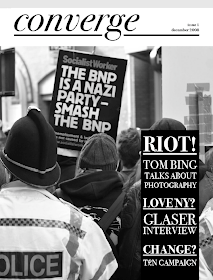
I want it to feel sophisticated without making it seem pretentious, the layouts are just using one photo, and trying out different logos and headings. Just having a play about really.


I'm not sure what the grey boxes are doing at the top of the screen grabs....
The ones with the serif heading seem a little pretentious, especially the italicised ones. My favorite logo is the one on the last cover. The choice of font (Lubalin Graph) goes really well with Avante Garde meaning that I can have two brand fonts that will work well together. The graphic above the g can also be used in different colours to reflect the cover image
No comments:
Post a Comment