I haven't posted anything since before easter. Sorry. I have been a busy boy.
The
End of Year Show stuff went to print yesterday. I have learned a lot from doing this. The first being: learn how to use InDesign properly. I couldn't really be bothered with InDesign, so I made a grid, screengrabbed it and opened it in Photoshop. I'm glad I'm not the one who had to give it to the printer. So yeah, don't make layouts in Photoshop. I have also learned the definition of 'graphic designer', it means 'the person that does the work, but makes no decisions'. The final thing that went to print changed so much (against my will). It was 'designed by committee' and I'm not very pleased with the final outcomes - especially when an hour before the deadline I was told that the Advertising tutor thought that the College logo shouldn't go in the bottom corner, it should be made to look like it is part of the pencil. I guess thats why he does advertising, not Graphics.....
Anyway, ranting aside, I'm getting £500 and it was a good experience.
Here are the final pieces:


On Monday me and Claire had our business studies pitch. It seemed to go OK. Ill add a photo of the business card next week, but for the time being here is the logo of our fictional design agency:

But yeah, I don't want to talk about business studies (sorry, 'enterprise and innovation'), because its boring and I'm glad its over with.
I handed my essay in last week. Again I'm glad to be shot of it. It is called
The Responsibility of the Graphic Designer. Click
here to read it.
At the minute I'm working on (re)designing an identity for myself. This will include redoing my website (to view the half a website that I made click
here ). I want it to be primarily type based, but I am finding it really difficult. Here are of couple of things that I have done so far:


As you can see none of them are amazing. I need to find a solid concept, instead of just trying to make a layout. I want to try and use woodblock type to construct the last one, to see how that comes out. I also tried using embossing to make a business card, I feel that this type of thing is more interesting, and maybe works better.

It is double sided, so that
Kyle Bibby is the right way on one side, and
Graphic Design is the right way round on the other.
I'm also doing a week long brief, called
Dig for Sanity that is about promoting allotments. Here are a few initial ideas.

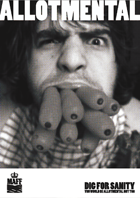


My two favorite ideas are
its all me (the bottom one), and the first one.
Throw in the trowel would be a set of three, the other two strap lines being
peas and quiet, and
thyme out.I have being trying to design a logo for the
dig for sanity campaign.
At first I tried to incorporate the term
green fingers into the logo, by using green finger prints, but I think that it has more crime/horror connotations.


I tried using a spade in the logo, but I don't really like it. Heres a few examples:

Oh yeah, I nearly forgot. Me and Claire got our D&AD entry finished. We decided to ditch
The Rumour Mill, and advertise the
BBC, as well as simplifying out idea down, by making just 3 adhesive posters. The word
LIE is cut out of each poster so that you can 'see through the lies'...


I'm not sure why grey boxes are appearing at the top of some of my images...
Anyways, apologies for merging four or five posts into one. I'm sure that there is loads that I've forgotten
Until next time
x


