Sunday 30 November 2008

convege

I have been trying to design the Converge letterhead and business card. I was initially going to put a spot varnish on the business cards, but I have changed my mind on account of spot varnish's poor environmental credentials.

So I decided to have a go at embossing instead:


Letter Head - Art+Design+Change


Same, but with text


Letterhead - Logo


Letterhead - Logo and Art+Design+Change


Same, but different


Business Card - logo

Thursday 27 November 2008

How I made Jupiter

I thought it was worth mentioning how I made Jupiter. I was quite important for me to make the typographic image as accurate as possible.


As I wanted to represent the planet accurately I used a photograph. I Live Traced it into nine colours (saving the tenth for the faint rings that aren’t visible on the photograph. I made each colour completely different to see the sections clearly.


I then created a path in the same shape as the planet (including the rings) and filled it with Lorum Ipsum. I changed the colour of the separate words to match the different coloured sections of the image.

Counting how many words of Lorum Ipsum were in each section allowed me to find 10 appropriate passages. Using the Lorum Ipsum as a guide on the layer below, I coloured each passage and fitted the words together like a jigsaw.

I'm not sure how apparent that is from the image - but it shows the live traced planet, beneath the Lorum Ipsum beneath the final copy.

Belated update

Again, I have been really lazy updating my blog...

First of all. I have stripped most of the stuff off my blog so that it can be viewed from my lovely new website. So next time you check out my blog (Mum and Dad) go to kylebibby.co.uk.

I got some IOM College Uni leaflets back from the printers not too long ago. I designed them with a plain white background because I wanted to use some really nice stock. The printer reckoned it would be too much to order in the specific Paperback stock that I wanted, but after showing them some samples they said that they had some similar house stock.

Photobucket

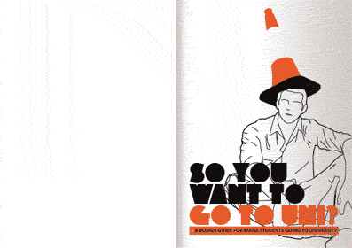
Anyway, upon getting some of them posted to me I realised that their house stock wasn't really that similar.... It's not too bad, it's just that the whole reason I left the background white was to show off some really nice paper, which hasn't really happened.

I managed to find a printers co-op in Leeds - Footprint - that stock Paperback stock, so I got some and reprinted the leaflet on nicer stock for the ol' portfolio.

Look out for my photo in one of the Manx papers next week (I'm a bit gutted they don't want me in my Halloween outfit, below a bit). The College is putting out an article about the Uni Leaflet

I Pinched Bing's new Lens Baby lens last night and took some photos of the leaflet (the stack is the original print, the single leaflet is my own print, though I'm not sure if you can really tell the difference in the photo.)


The week before that I got back some stickers, and I apologise how unprofessional this might sound but they were absolutely shit. I could have done it better with my £40 inkjet printer that is running out of ink, and them cropped them with my teeth. In fact I would say thats exactly how they look like they were done.

You lose some a bit, you lose some a lot.


Also, one last thing before I go again for a while. Halloween photos (taken by Bing with his Lens Baby):


LS6 BMX official pumpkin


Joe, dressed as Alan Partridge dressed as a zombie


Mole


Kyle's light artillery


Me and my new barnet


Verity


Me again


Tom, getting a new barnet


The Lads


The lessons we learned this halloween are:

beer+hair+lino=sticky mess


beer+par cour+mullet+pizza shop=bloody redneck mess in a pizza shop+crying


Wednesday 26 November 2008

Jupiter progress report

I managed to replace the latin with 10 layers of understandable information:


I have printed it onto acetate and bound it rather crudely:


I now need to decide on size and format. I think it would look good really big.

I want to try and make it a fold out wall chart, meaning that some of the information would have to be upside-down and inverted in the planet, so that it would be the right way when folded out.

More Space

I have tried taking one of the planets - Jupiter - and filling it with type. I have used ten different colours of type on ten layers, thinking it would be really good to be printed on ten sheets of transparent stock. I have just used lorum ipsum for now to see how it works. If I do use this idea then it means that I'm breaking the sections of the publication down a further 10 times.

This is my first attempt. The text mimics quite closely the patterns on Jupiter:


This one is slightly more regimented - the type still over laps, but it all runs on a horizontal baseline.


And printed (poorly) in black and white on acetate:


This one is much more regimented, when the layers are over each other the words should all line up on the same baseline:


And on acetate:


I'm fairly pleased with all of them, especially the last one. I now need to try and do it with legible english information...

Tuesday 25 November 2008

Solar System Wallchart


I bought a couple of astronomy mags the other day. One had this really nice wallchart free with it.

Great combination of illustration and infographics. Well done.

Solar System Wallchart


I bought a couple of astronomy mags the other day. One had this really nice wallchart free with it.

Great combination of illustration and infographics. Well done.

Magazines

Following on from my previous post about the Solar System wall chart; I bought a couple of magazines - National Geographic Space and Astronomy Now.


Astronomy Now was a little too 'astronomy' for me. Lots of articles about choosing telescopes, astronomy clubs etc, however the National Geographic magazine had some stunning imagery and overall was a really good, well designed magazine (as well as having a free wall chart).

Here's some of my favorite photographs:


Photobucket


There is also some cool info graphics: