It's strange because Andy Cody has also been getting into technical drawings, and was showing me some work he did for a car manufacturer. Here they are pinched from his website - andycody.co.uk


He uses line really well - picking out different details and using different stroke weights.
I also found this on Typeneu.com the other day, by Valentin Adam. Both sheets fold out and fit, like a key, over each other. I really like the clean graphic style, which makes something potentially boring really interesting.


It reminds me a bit of that guy (sorry, I don't know his name) from second year graphics, who had that information graphics at the end of year show. Impressive stuff.
I have been looking at old maps recently. I borrowed this book of old maps of the Isle of Man from my Dad recently, but unfortunately I haven't got any scans from itany scans from it.
But I did by this map from the train station that had four OS maps of Leeds from different times. Here's a close up of the 1841 - 1858 map. Its crazy to think that it is all hand made.

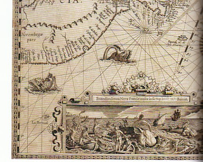
I also picked up the book called Mapping the World, by Peter Whitfield, from Oxfam, for a fiver. There is some amazing imagery in it:


I'm entering the Don't Panic poster competition. The word is Machine, at first was going to do something 'deep' about the war-machine, or the political machine, or nature as a machine, but I thought that was a bit stereotypical and a lot of people might do similar things.
So I thought I could do about how machines could be good, or they could be bad. I want to have a poster divided into 2 sections: Good Machines, and Bad Machines. Keep it lighthearted.
I imagine it as a cleaner looking version of a Shrigley illustration. Kind of.

See you later A.C. Slater!
x


No comments:
Post a Comment