I spent about 3 hours today attempting to make vegan ricotta and sun-dried tomato tortellini with vegan pesto.
The ricotta worked a treat (honest)—it was mainly made from tofu with some basil, lemon and nutritional yeast, and is based on a recipe by Isa Moskowitz.
It was my first attempt at making pasta from scratch and it very nearly worked. In fact, I would go as far as saying it did work, except I didn't have one of those pasta manganel things so the past was a bit thick and in places was more like dough balls than pasta.
I am now feeling very satisfied, if a little sick...
Wednesday, 2 December 2009
Mark Bittman
I found this really interesting TED talk by Mark Bittman about whats wrong with what we eat. Have a watch:
Told you meat was bad...
Monday, 30 November 2009
Chartered Institute of Marketing
Graduation
Last week I was honoured to graduate in the first graduation ceremony that Leeds College of Art have organised independently from the University.
I was also honoured to design all the venue dressing and printed material.
Here I am holding the ceremonial staff, trying my best not to do Gandalf impressions ("You shall not pass!"), standing with Chloe and Rose from the LCA marketing team in front of one one of the banners Merlin and I designed.
I was also honoured to design all the venue dressing and printed material.
Here I am holding the ceremonial staff, trying my best not to do Gandalf impressions ("You shall not pass!"), standing with Chloe and Rose from the LCA marketing team in front of one one of the banners Merlin and I designed.
Wednesday, 11 November 2009
Far From Home?
Me, Tom Bing and Sally McGee have put together an exhibition for The Manuel Bravo Project called Far From Home? in The Light Leeds. It was hard work but we got there eventually—I think were all pleased with the outcome. Below is the poster and some initial photos that Tom took today.
PS farfromhome.org.uk coming soon!
Tuesday, 10 November 2009
For Print Only
A little late I know... but design blog/website For Print Only were kind enough to feature mine and Merlin's LCA prospectus design. Check it out here (its prob a few posts down by now).
Friday, 30 October 2009
Out with the old, in with the new.
It's been a while since I last posted. Apologies to any avid fans out there...
This post marks a pivotal time in my life. It marks the point where I completed the transition from design student to designer—although it doesn't feel any different, I'm still learning new things on every job that I do (something I think, and hope, will continue for a long time to come).
I graduated from Leeds College of Art in June, and was lucky enough to get a First (I say 'lucky' because I don't believe that the marking system truly represents a persons ability as a designer, ie you can be a first-rate designer and get a Third, or a third rate designer and get a First). I then moved in with Merlin Mason and Cat Wickes, two other designers, one of which I'm romantically involved with (I'll leave it up to you to guess which one)—we have a nice big studio room in our house, which is awesome.
Since then I have have managed to get my stumpy Manx hands on quite a lot of interesting (and by-and-large 'bill paying') design work. Although admittedly a lot of it has come from the same client — I should take this opportunity to say thanks to Leeds College of Art for keeping me from starving.
I started by designing and art-directing the Leeds College of Art prospectus with Merlin Mason, which was really great—my biggest job to date, and I have just finished designing an English text book for Tibetan refugees in India for TCV. I have also done a couple of jobs for the south Asian arts organisation, Kala Sangam—a book documenting their Kala Pal project, and their autumn programme. At the same as this I was designing a booklet (showing off student awards) that folded out into an A1 wallplanner for Leeds College of Art. I am currently working with photographer Tom Bing and the Manuel Bravo Project on an campaign and exhibition in The Light (a shopping centre/cinema/other stuff in the center of Leeds) called Far From Home? that deals with the issues surrounding asylum seekers. I am also working with Merlin Mason to design my own graduation ceremony (banners, invites, certificate holders, programme, etc).
That's about it. I will try and keep my blog fairly up-to-date from now on...
Sunday, 7 June 2009
FMP Evaluation
Note: I completely forgot to explain how I’ve written my Statement of Intent in my hand in. Basically, the main text is my original SOI, and the italicised text describes how each section has changed. Apologies for any confusion.
Throughout my third year, my overall rational and intentions as a designer have changed very little. They have mainly been concerned with professionalism—producing work based on ‘real-life’ considerations such as audience, timescale, budget, etc—and social responsibility—approaching design from the point of view that design doesn’t exist in a vacuum, that it is one link in a much larger chain, meaning that, for me, questions of responsibility need to be about more than specifying recycled paper. During my FMP I also started wanting to make myself a more ‘rounded’ designer, because I believe the ability to design websites (when someone else may not be able to), for example, could be the thing that wins or loses you a branding job. The more ‘strings in your bow’, the better. A lesser goal for my Final Major Project has been to have fun and experiment, as this is possibly the last chance I have to be in full control of my work.
While I wouldn’t say that I am now a professional, versatile and responsible designer, I would say that through my Final Major Project I have improved in the areas I wanted to. Different briefs helped me in different areas. For example doing web design for an ethically driven company has helped me become more versatile by developing my basic level of web design knowledge, forced me to work to tight deadlines, and given me an insight into working for clients concerned with social responsibility. However, my Made You Think brief allowed me experiment, and develop my understanding of various social issues, however I went about this brief in the most unprofessional, erratic and rushed way.
I feel that the smaller briefs (with the exception of the EYS competition) went fairly well, I engaged with them and felt I learnt from them. I also really enjoyed putting together the design context book, which I feel let me explore the design industry as well as giving me an excuse to really experiment with layout (obviously the typo on the cover and the print defects were a low point). However, I’m not sure how I feel about my work for my main brief (Made You Think). When I look at my outcomes I think that what I have done is fairly good—for the best part functional designs that look alright—but I think I wanted more than that, I wanted something a bit more cohesive and thorough. My submission for this brief, with the possible exception of the booklet, felt more like examples of ‘how it could be done’ than a finished ‘series’. I think that there are a number of reasons why this brief wasn’t quite as strong as I would have liked it to be, and it’s mainly to do with project management. I spent too long at the start researching and being confused with what exactly I wanted to produce, putting off committing to any actual decisions. This resulted in most of the design work being done in the last few weeks, which I thought would have been fine, except I hadn’t factored in the day to day setbacks—spending ages chasing up emails, wasting a whole day trying to upload my Design Context book to Lulu (and then a further half a day when they printed it wrong), spilling coffee on my keyboard and being without a keyboard for a weekend, etc. Things like that are regrettable and I’m a bit annoyed with myself for being so unorganised, however the main factor in my manic struggle over the final few days before the deadline (and the resultant unorganised hand-in) was the 2010/2011 prospectus pitch I decided to enter the week before the deadline. Winning this took a couple of days away from college work (meetings and a photo-shoot), at a time when I really couldn’t afford to spare any time. I don’t see this as a bad thing however, as I think the prospectus design (as a portfolio piece) is more important, in terms of my future, than a good grade (similarly, doing an internship at UHC meant that my FMP got off to a slow start, but it was worth it because I got valuable experience, a job offer, and the promise of future collaborations). So in that sense it was a worthy sacrifice, and although I’m not 100% satisfied with my submission, there is at least a little time to make things better for the show—I think that having a good show and selling yourself visually is arguably as important as getting good grades.
In summary, I don’t feel like I have progressed much as a ‘design student’ (in terms of ‘ticking the boxes’ getting good marks, etc); but what my FMP has done, however, is helped me on my way to becoming a professional designer.
Labels:
Design Context,
Design Practise,
Final Major Project
Thursday, 4 June 2009
More water, and chocolate
I decided that the photograph for my 'water' post cards should show 9 bottles of dirty water and one bottle of clean water, instead of 9 empty bottles and one full, to represent giving 10% of people clean water. So I reshot the photo, using coffee as dirty water:
Here it is on the post card design:
I had my first experience of buying stock photography today as well and bought a couple of photos from iStock for my chocolate/child labour post cards:
To make them more cohesive I comped in an out of focus background onto the one of the photos, here's the final postcard design:
So that's all for the series I'm calling Two Sides to Every Story (maybe).
Here is the bill and ad-shell versions. They would be on the billboards/adshells with the changing images:
Wednesday, 3 June 2009
Two photoshoots, one day, no messin'
Yesterday me and Merlin art-directed a photoshoot with Adrian Ray for the prospectus design. We wanted photos of people interacting with their work, that would sit along side a quote by the student about their work. This is an attempt to portray what actually happens at the college—we felt as though the wishy washy quotes that they had last year (for example: "The college is lovely and everybody is friendly and I like it and its nice") didn't really give people a sense of what went on.
Here I am, all being in charge and stuff. Well, I didn't really have to do much as I think Adrian understood pretty well what it was we wanted.
After that I bought a pizza for Kyle so that I could get Bing to take photos of it representing world hunger and Western greed. Here's some of them:
I combined them with a stock image of a table cloth, and as if by magic, it now looks like the plate is on the table cloth.
The end of the knife and fork on the top one are possibly a bit rubbish, but they get covered up with text, so don't even worry about it.
And the final postcards:
You'll notice I got rid of the thought bubble from the logo, it was a bit rubbish and predictable—best just keep it simple.
Monday, 1 June 2009
Final Wallchart
Sunday, 31 May 2009
Photo-vector phone
Because the phone I took a picture of was really scratched I had to devise a way of making it look shiny new again.
Basically I didn't want a vector, but I wanted the phone to look crisper than it ever would in a photo, if that makes sense. So I made a vector phone, set it to 80% opacity and laid it over the top of the photo, meaning its really crisp but you get some of the natural texture coming through.
I'm not sure how well you can see it on here (it doesn't really look much different from the plain vector):
So that was supposed to take like 2 hours. It took around 10....
Basically I didn't want a vector, but I wanted the phone to look crisper than it ever would in a photo, if that makes sense. So I made a vector phone, set it to 80% opacity and laid it over the top of the photo, meaning its really crisp but you get some of the natural texture coming through.
I'm not sure how well you can see it on here (it doesn't really look much different from the plain vector):
Original photo
Vector:
So that was supposed to take like 2 hours. It took around 10....
Saturday, 30 May 2009
The Sun's coming up, and I'm trying to be Monkey Dave
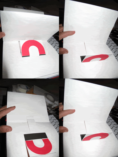
I have been trying out a new mechanism to juxtapose two images, which vaguely rips-off one of the pages of ABC3D by Marion Bataille
First mock-up:
Basically, it relies on the pressure between 2 sheets of card to snap into place.
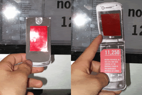
Telephone
Fact one (will be printed in black on transparent red acetate):
80%
The amount of mobile phones that contain minerals mined in the Democratic republic of Congo
Fact two (inside phone, behind transparent red acetate, but invisible due to it being red)
11,250
Number of deaths, per week, in the civil war over the minerals found in the Democratic Republic of Congo
80%
The amount of mobile phones that contain minerals mined in the Democratic republic of Congo
Fact two (inside phone, behind transparent red acetate, but invisible due to it being red)
11,250
Number of deaths, per week, in the civil war over the minerals found in the Democratic Republic of Congo
Friday, 29 May 2009
Nice lil interactive diagram from Oxfam
http://www.maketradefair.com/en/pages/diagrams/patents.htm
Labels:
Design Context,
Design Practise,
Final Major Project
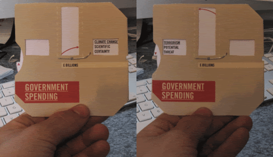
Government Spending
I have been trying to present the comparison of the amount of money spent on combating terrorism and the amount spent on combating climate change, in a more interesting way.
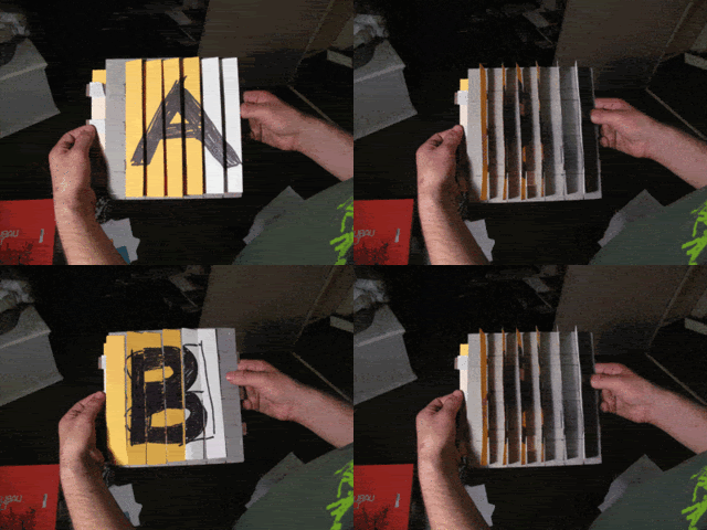
I tried making another primitive lenticular thingy. I made the ridges wider so it would be easier for me to fold.
Good and bad news; it was really easy to fold, however, it didn't really work.
Original images shown with photos of lenticular thingy:
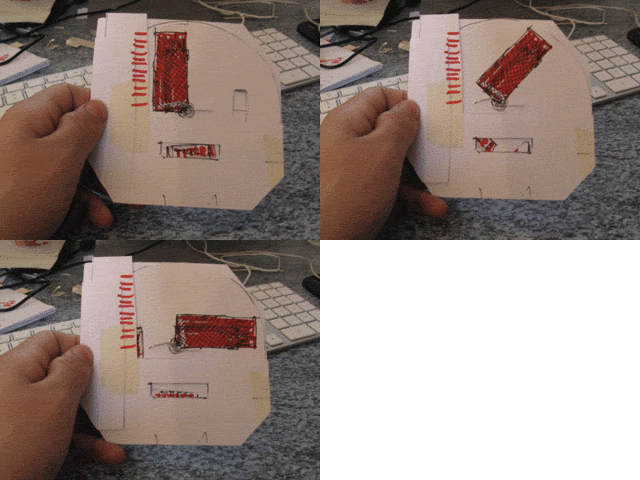
So this didn't work. I decided to try something more hand-held (don't ask why). I had this idea where the 'bar' of a bar chart could spin around 90 degrees and change its 'height', while at the same time the title would change in a window at the bottom. Here is a mock up I attempted:
After seemingly hundreds of mock up (at least 5) I came up with this:
Subscribe to:
Posts (Atom)