Sunday, 31 May 2009

Photo-vector phone

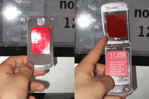
Because the phone I took a picture of was really scratched I had to devise a way of making it look shiny new again.

Basically I didn't want a vector, but I wanted the phone to look crisper than it ever would in a photo, if that makes sense. So I made a vector phone, set it to 80% opacity and laid it over the top of the photo, meaning its really crisp but you get some of the natural texture coming through.

I'm not sure how well you can see it on here (it doesn't really look much different from the plain vector):


Original photo


Vector:


So that was supposed to take like 2 hours. It took around 10....
Saturday, 30 May 2009

The Sun's coming up, and I'm trying to be Monkey Dave

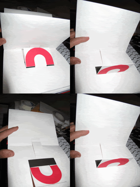
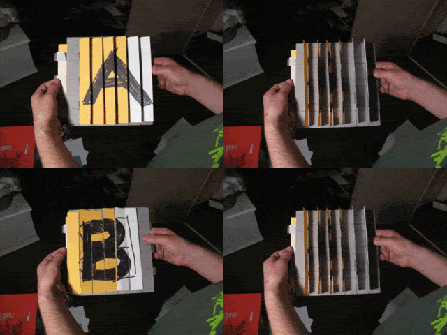
I have been trying out a new mechanism to juxtapose two images, which vaguely rips-off one of the pages of ABC3D by Marion Bataille

First mock-up:

Photobucket


Here's the page from ABC3D

Photobucket

Basically, it relies on the pressure between 2 sheets of card to snap into place.

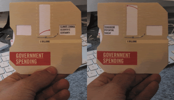
Updated Government Spending spinner

Now include pound coin imagery. I think I prefer the coin inside.


Telephone

Fact one (will be printed in black on transparent red acetate):
80%
The amount of mobile phones that contain minerals mined in the Democratic republic of Congo

Fact two (inside phone, behind transparent red acetate, but invisible due to it being red)
11,250
Number of deaths, per week, in the civil war over the minerals found in the Democratic Republic of Congo

Photobucket

Friday, 29 May 2009

Nice lil interactive diagram from Oxfam

http://www.maketradefair.com/en/pages/diagrams/patents.htm

Government Spending

I have been trying to present the comparison of the amount of money spent on combating terrorism and the amount spent on combating climate change, in a more interesting way.

I tried making another primitive lenticular thingy. I made the ridges wider so it would be easier for me to fold.

Good and bad news; it was really easy to fold, however, it didn't really work.

Original images shown with photos of lenticular thingy:


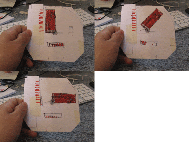
So this didn't work. I decided to try something more hand-held (don't ask why). I had this idea where the 'bar' of a bar chart could spin around 90 degrees and change its 'height', while at the same time the title would change in a window at the bottom. Here is a mock up I attempted:

Photobucket

After seemingly hundreds of mock up (at least 5) I came up with this:

Photobucket

Thursday, 28 May 2009

Creative Review / BETC Euro RSCG / The Clocks Project / Crap photo

I found this in the new Creative Review. Its brilliant. Every 12 hours the 321 clock mechanisms inside an ad-shell spell out 'Every 12 hours in Africa, over 2,000 people die of Aids becuase they have no access to care. Every minute counts. www.solidarite-sida.org'.

Well done!

Couldn't have worked out better

My Design Context book came back from Lulu yesterday. Looks quite good — except the typo. Oh, and Lulu messed up the printing in places. An all round success if you ask me...


Typo:


Spread 'em:


How a 3% black drop-shadow prints at Lulu... as a solid black box...awesome:

Wednesday, 27 May 2009

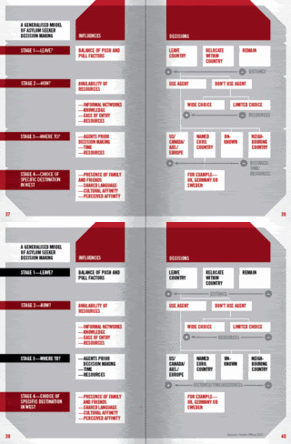
Asylum Booklet

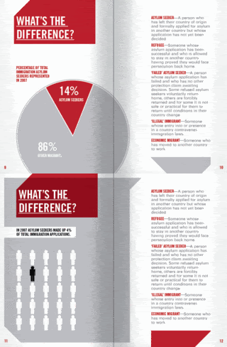
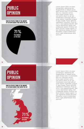
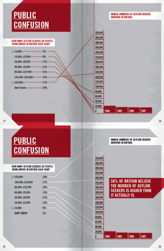
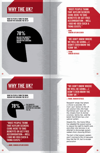
Me and Sally have started interviewing various asylum seekers, so I decided I had enough content to finally start designing properly.

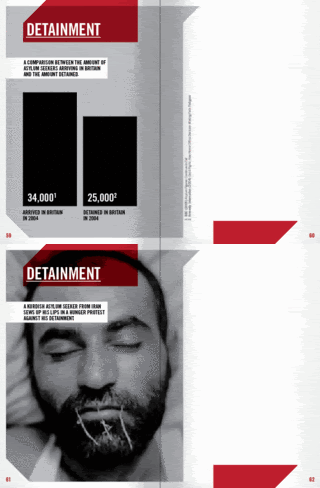
Basically, I have tried to make the 'cropped' corners feature a little more. Also, because I like how the red 'overlays' the photos, I have cropped the grey boxes before the edge so that you get the same effect with the solid grey boxes. Here are some spreads:


and some I'm still developing, or are not sure of:

Photobucket

Photobucket

Photobucket

Photobucket

Photobucket

Photobuckett

Friday, 22 May 2009

Booklet Cover

I have been trying to design the booklet cover—I have decided that I am using Trade Gothic, and these red box thingies. My hope is to have a simple title with a contrasting image behind it. Not really sure how good any of them, I think the best is the boys face, because it shows more 'humanity' than the others, and is more open to interpretation.


Thursday, 21 May 2009

Logo

Some of the feedback I got from my final crit was about the logo: too much black space around title, thought bubble may not be 'serious' enough for nature of campaign, looks a bit like Drink Aware campaign.

I decided that I didn't want the logo to be too 'hard hitting', as it needs to be approachable. Also, I I want the aim of the campaign (apart from getting people to visit the website), to be getting people to just stop and think for a moment; I'm asking people to take any kind of direct action.

I have been playing around with addressing the other two logo comments:


Second to last one?...Hmmm.

Final Crit

I had my final crit yesterday. It really doesn't feel like I'm that close to finishing.....

I was up most of the night putting together presentation boards of the briefs that I have already finished (bar End of Year Show, which I forgot about):


I also rewrote my two main briefs into 1: